


New 2025 NWSL kits ranked
The ugliest and sexiest all 14 team kit drops this year

As tradition would have it, the 14 NWSL teams have released their secondary away kits for the 2025 season. This year’s drop was overall better last year’s, which gives me a general sense of hope that the league is moving in the right direction. Half of the new kits this year feel like the designers at Nike were actually taking in style tips and fashion trends rather than trying to be the most unique walking billboard on the pitch. I still feel like the NWSL has a long way to go in designing merch that slaps, but some of the jerseys this year feel one step closer to making that dream a reality.
Keeping last year’s primary NWSL kits in mind, here is my officially-not-so-official ranking of the new secondary NWSL kits from ick to meh to fire.
Ick factor: High
Chicago Stars FC “Liquid Mercury” kit
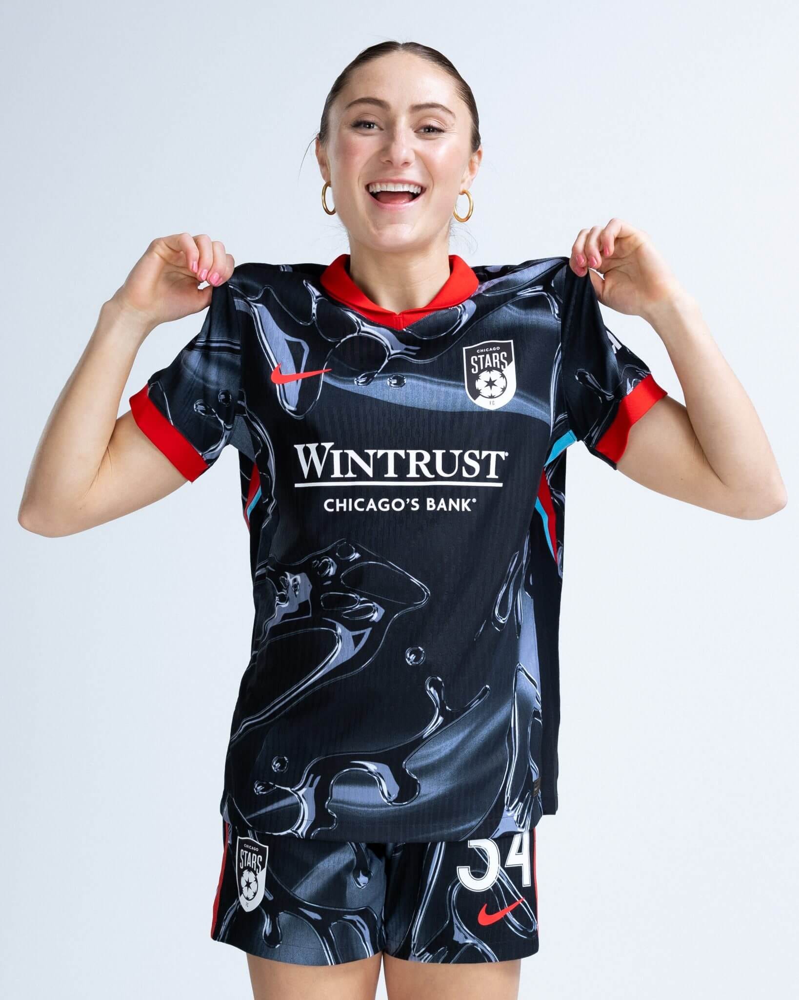
The 2025 NWSL kit that gives me the biggest ick has to be the Chicago Stars FC Liquid Mercury. I, too, went to The Bean when I visited Chicago for the first time at age 16 and took a warped and artsy blob-like photo of myself so I could be unique in the early 2000s. But most Chicagoans don’t need liquid mercury to be their whole personality! This jersey is giving the opening credits to I, Robot circa 2004. I can totally see these CGI-robotic babes standing on the sidelines of the Chicago Stars’ away games rocking the Liquid Mercury jerseys en masse.

Ick factor: High
Houston Dash’s “Cosmic Storm” kit
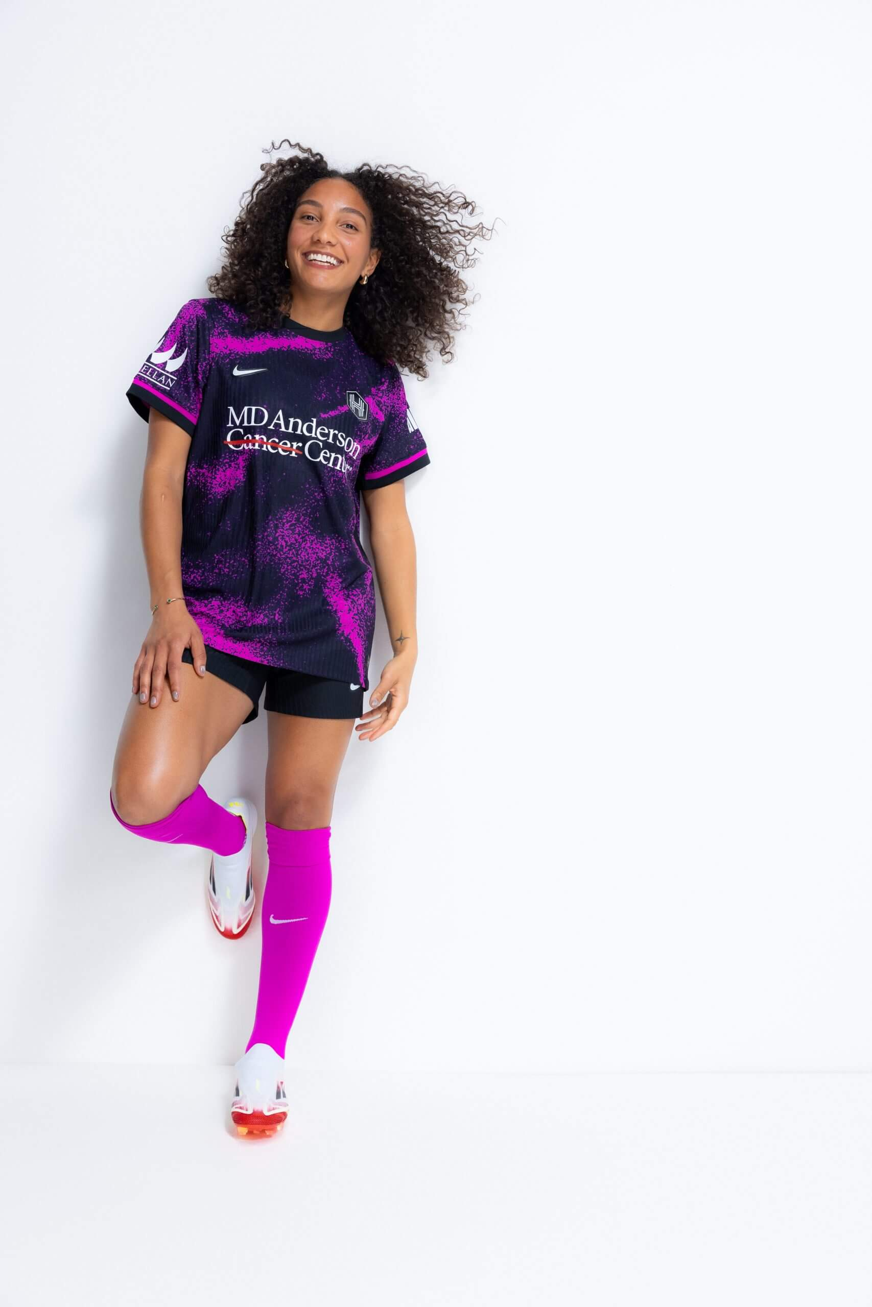
This kit looks like the neon spray-painted Jansport backpack of a punky Hot Topic teenager vaping in a mall parking lot. There is just something that feels a bit juvenile about the whole “splatter paint” concept, not to mention the blinding shade of fuchsia. I personally don’t think we need to be incorporating fluorescents into any of the NWSL jerseys at any point in time. This jersey is like the preppy girl coming back to school with her eyebrow pierced and purple streaks in her hair after the off-season, which might be apt given the emotional landscape of the Houston Dash team coming into this new year.
Ick factor: High
Washington Spirit’s “Shockwave” kit

Bless Trinity Rodman and the effortless swag that she can infuse into any kit, but the color combined with the sponsor logo is giving me flashbacks to panic buying a 4-pack of highlighters from the back-to-school section at CVS. I will say that the “shockwave” shade is an upgrade from the butter yellow secondary kit from last year, but there is something very Pikachu about the whole aesthetic. Luckily for the Spirit fans, their stripey primary kits are still sexy.
Ick factor: Mid
San Diego Wave’s “Altamar” kit
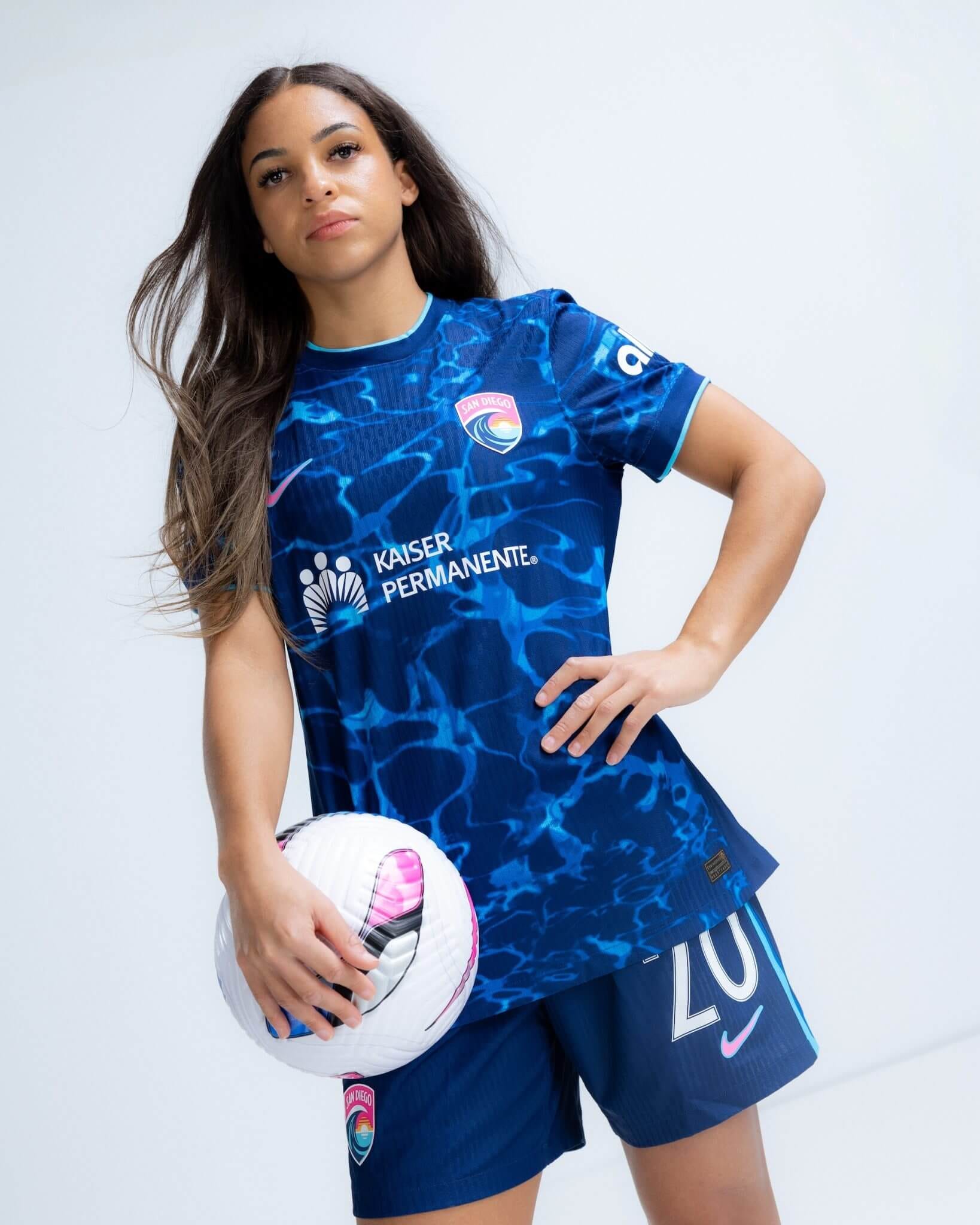
The San Diego Wave branding is hard for me to get behind. To be honest, they went a little too hard on the Billabong surfer girl beach bum for my liking with the hot pink, orange, and turquoise commitment. This secondary kit is actually a step up from all of their other jerseys in my opinion, but the Kaiser Permanente splash pool is still a little too on the nose for me. We get it. San Diego is water, waves, ocean, beach, sunsets, and 70 degrees every day. I’d like to see SD’s next kit go a little beyond the obvious.
Ick factor: Mid
Utah Royals FC’s “The Great Salt Lake” kit
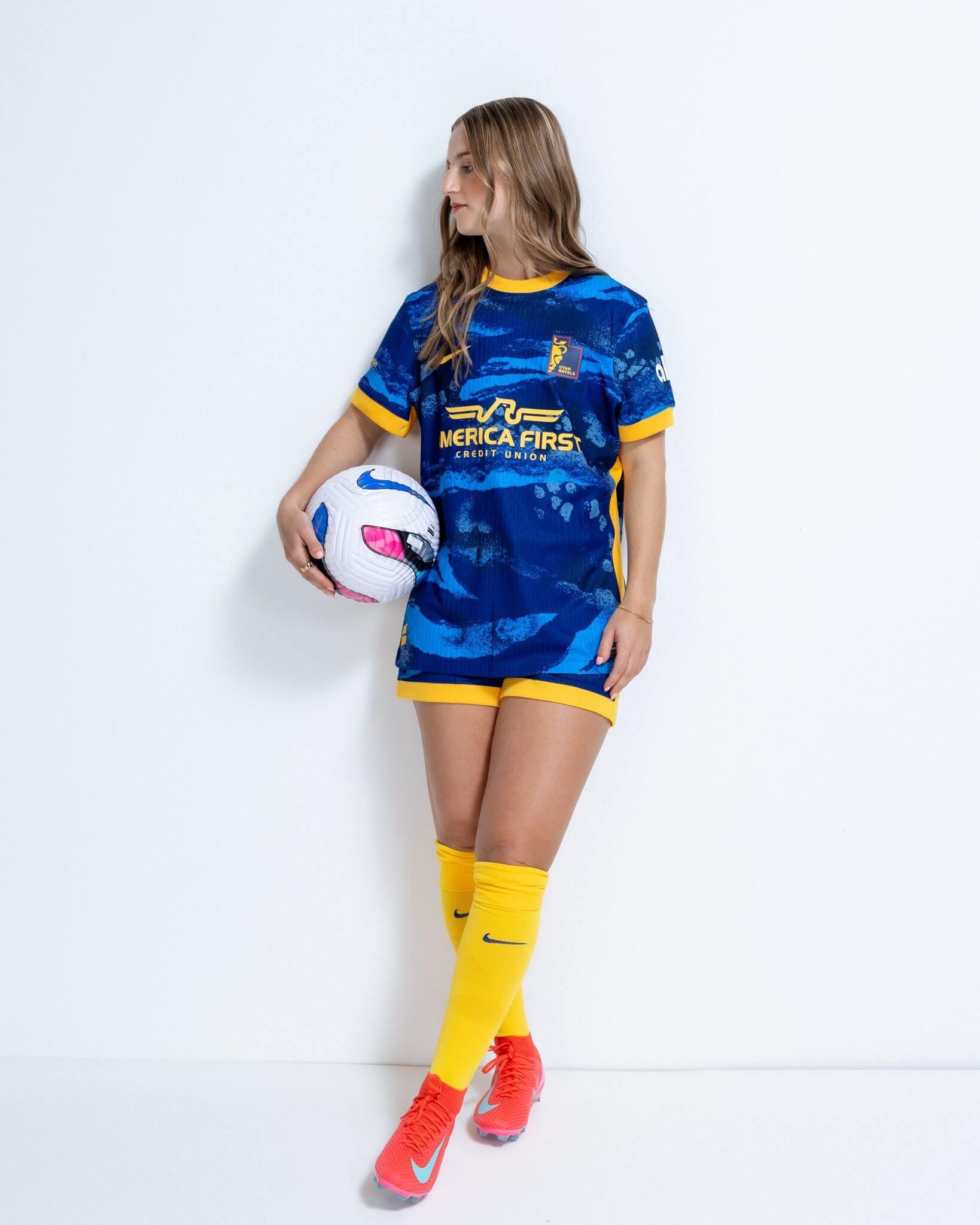
Listen, being from Colorado, I am a topographical girlie. I actually saved a topographical image of the States to my desktop the other day because I was so mesmerized by the topography of the West. But the execution of this jersey is a bit all over the place. First off, I’ve never seen that shade of blue once in my life in the entire state of Utah. Utah is literally one of the driest states in the country—both in terms of water and alcohol consumption.
But maybe the thirst-quenching shade of deep blue in the jersey is more of a manifestation than a reality? The Utah Royals are donating $10,000 to the conservation of the lake in partnership with the Great Salt Lake Water Trust, so even though the jersey is a bit of a conceptual shot in the dark, I can get behind the ecological preservation of it all.
Meh factor: High
Kansas City Current’s “Teal Town” kit
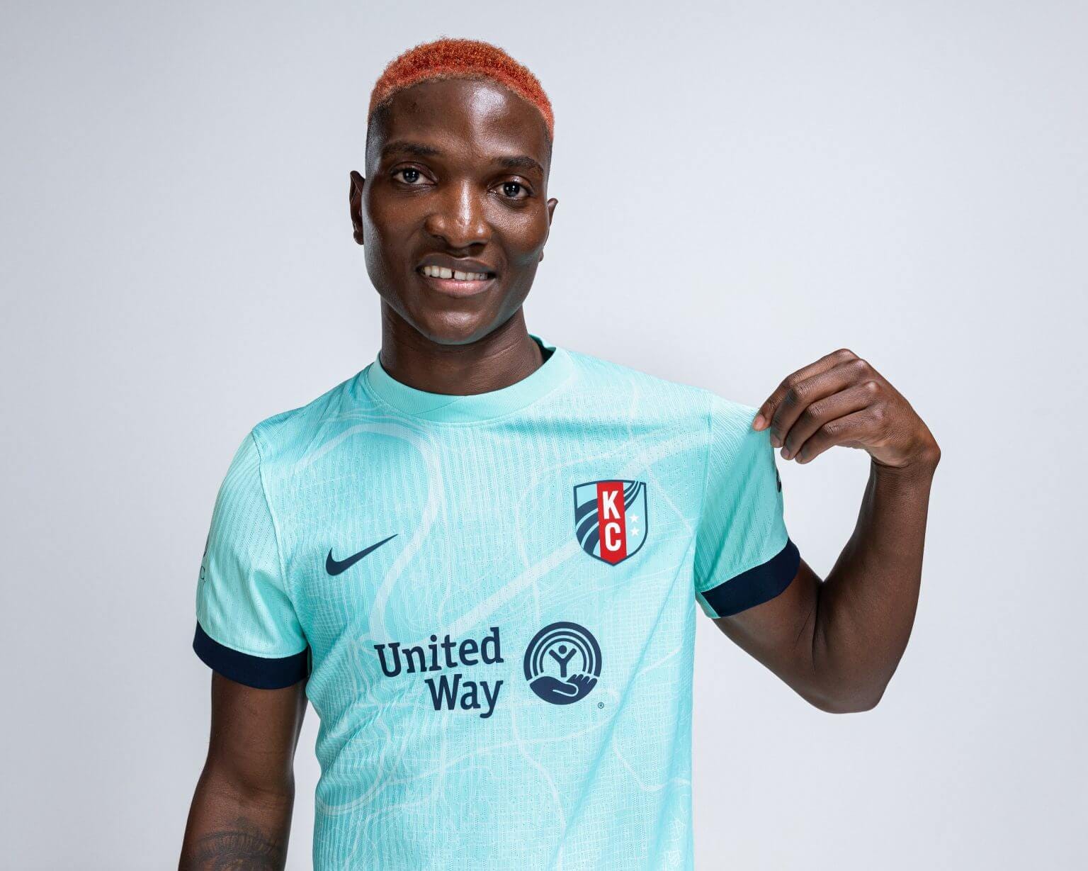
I have very little to say about this jersey, so I suppose that is a good thing. I guess I’ve never really understood why Kansas City fans have all rallied around the color teal. I don’t mind it as an accent color, but an entire teal jersey? ¯\_(ツ)_/¯ Also, not to be that guy, but does anyone think this kit is more of an aqua than a teal?
I do think that Temwa Chawinga looks very sexy. And I’m happy the fans got what they asked for. I’m even happier that both Gotham and KC Current have laid claim to all of the shades of light aquamarine/teal/sky blue so that the Denver team kits won’t go anywhere near them.
Meh factor: Mid
Angel City FC’s “Los Angeles” kit
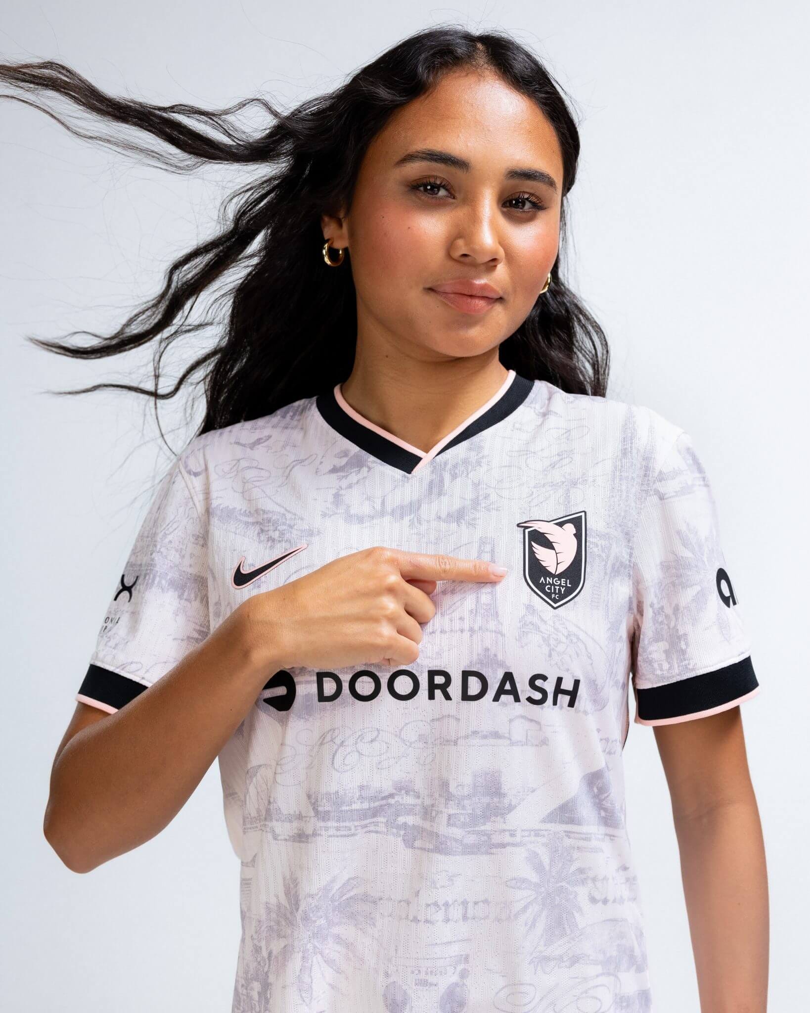
First things first, I don’t hate it. As a former ACFC fan, I think that this jersey is a step in the right direction for the team. The collar is sexy, the sleeves are great, and I love the low-riders and palm tree homage to LA. But why does the shade of pink end up looking like a white shirt that was washed too many times in a dark load? Also, the print is so faint, I actually had to squint to make out what was going on there. Bold is better, but I can appreciate the evolution of ACFC’s kits. Let’s just hope that translates to some evolution on the pitch (and in the ownership) as well.
Meh factor: Mid
Portland Thorns FC’s unnamed jersey I like to call the “Disturbia” kit
This isn’t the worst kit in the world, but it isn’t the best either. Something about this jersey is giving me dystopian vigilante neighborhood watch. Maybe it’s the enormous size of the sponsorship haunted by that glitchy background, but this jersey sort of feels like The Matrix meets Disturbia meets the Citizen app. The black a step up from the colorways of last season, but I’d wait until next year to go all in on a jersey.
Meh factor: Low
NY/NJ Gotham FC’s armored aqua kit
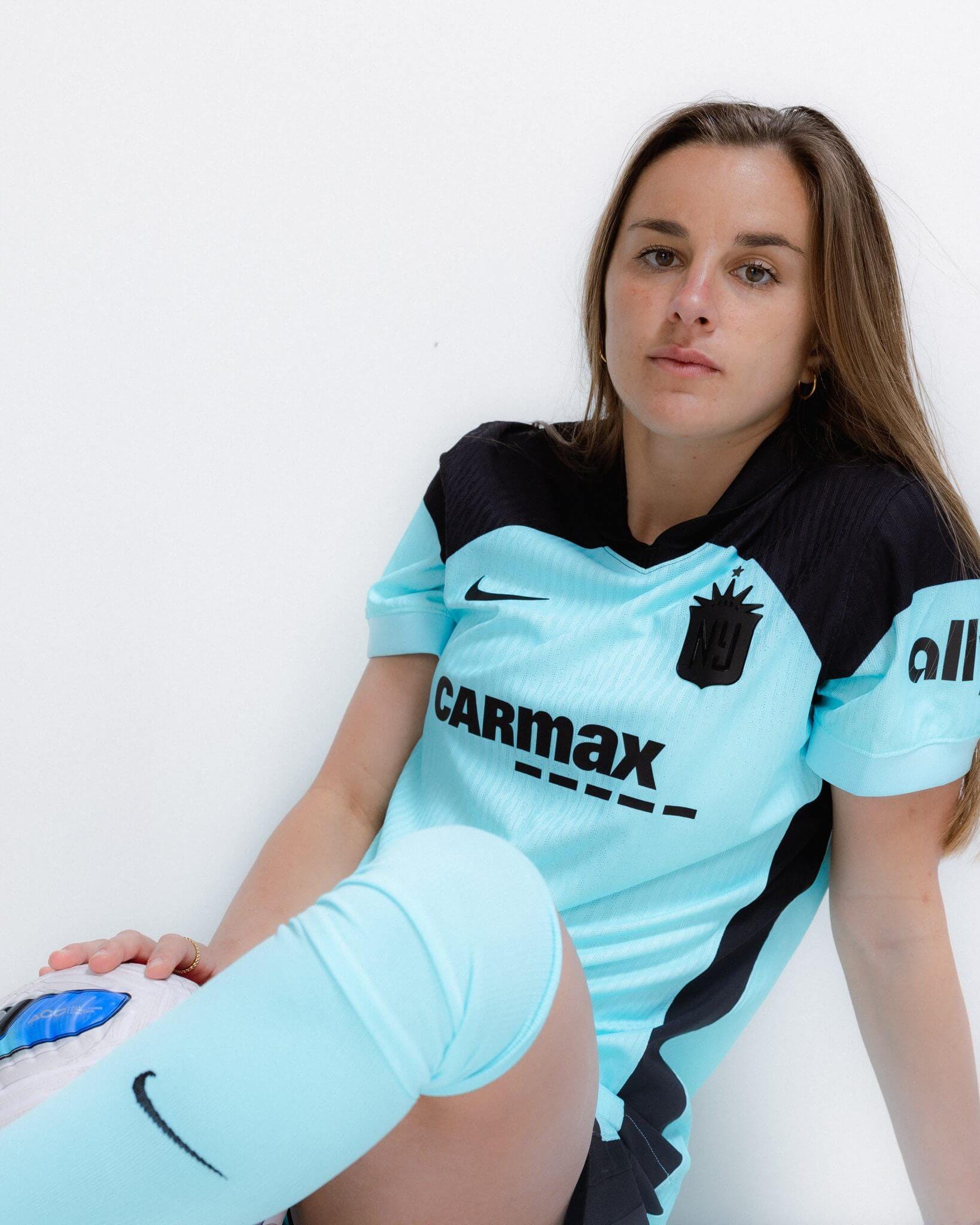
I’m not gonna lie, my controversial take is that I’m kind of digging the armored shoulder pad vibe here. It’s definitely giving Batman/Batwoman/Batperson. Plus, the ally plug on the sleeve warms my gay heart. Even if I know it’s a bank, I’m here for the double entendre. I like how simplified the secondary kit is, and the subtle stripes are an instant classic. Even though I’m not a big sky-blue girlie, it somehow works against the strong black. This secondary seems like a good offering for the die-hard fans.
Fire factor: Low
Seattle Reign’s “Rise” kit
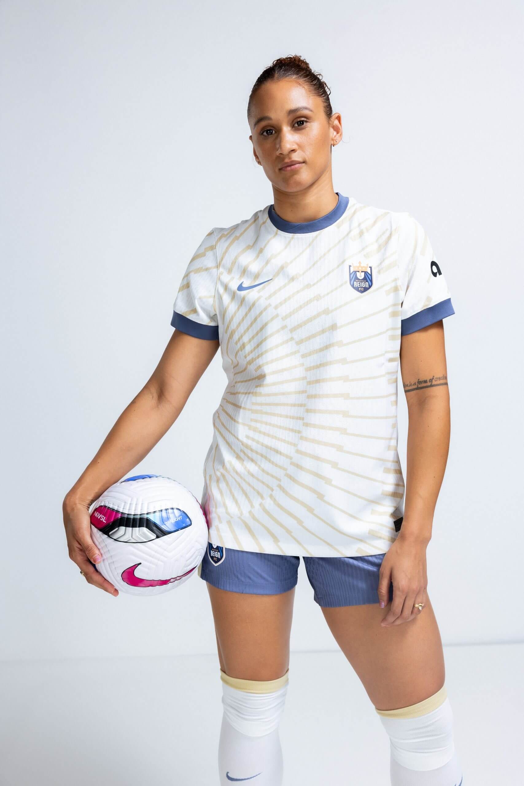
I love this kit for Seattle. The denim blue color on the trim and shorts is understated in a good way. It’s crisp, clean, and refreshing to see The Reign get back to its roots. The gold could be golder (what’s up with the extremely faint background in so many secondary kits this season?), but I also think that this is a non-offensive secondary kit that will age well. Hopefully the whole “rise” concept for this new Seattle Reign team will translate to the standings this season.
Fire factor: Mid
Orlando Pride’s new primary “Decennial” kit
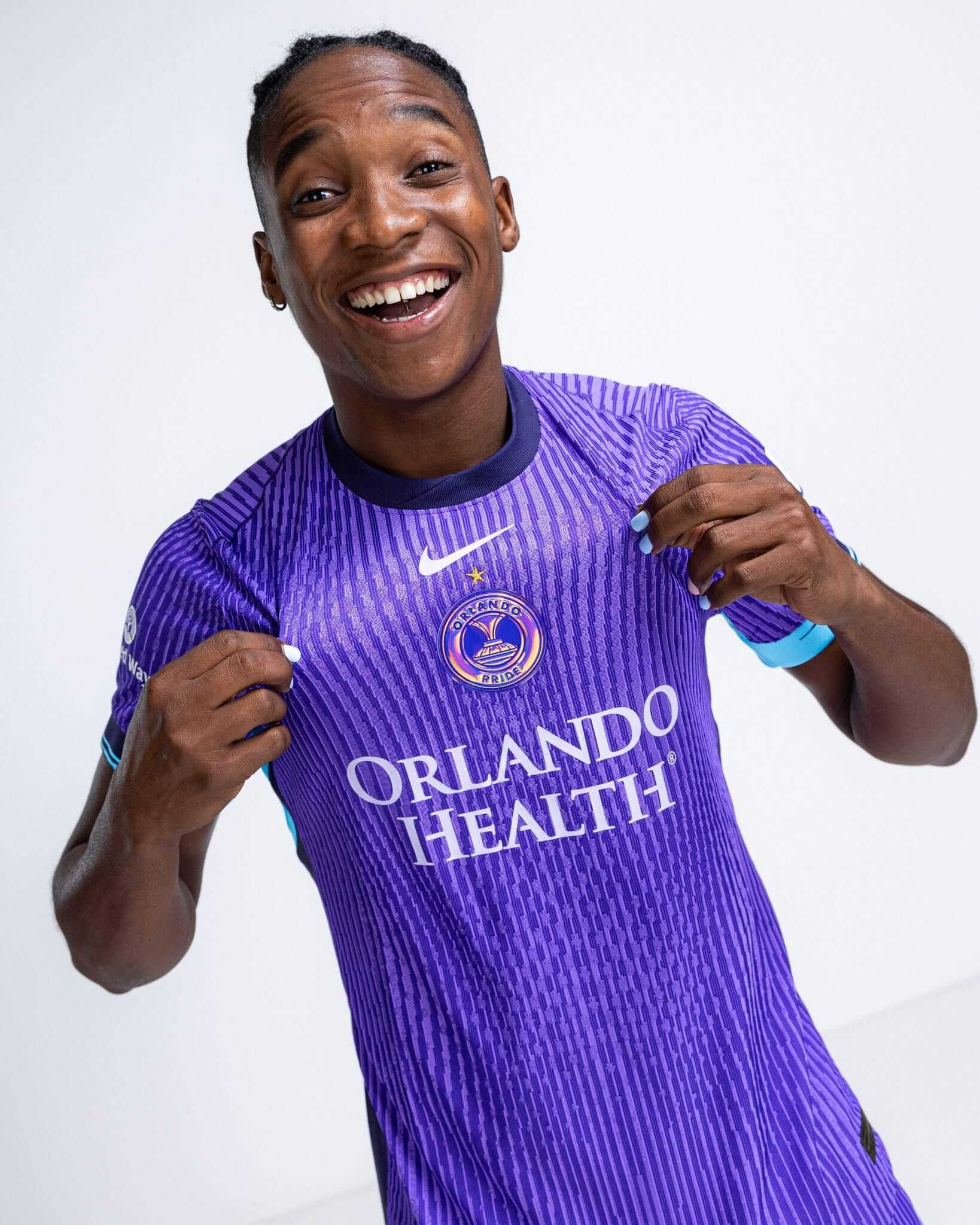
This one is actually going to be the primary kit in honor of the Orlando Pride’s 10-year anniversary, and I think that’s a big upgrade for a team that has climbed its way up the league and took home a championship last year. I can’t knock The Pride for this one. I love a textured jersey. Even though the groovy color scheme in the crest that looks somewhat like Lisa Frank on a 70s disco acid trip is strangely working for me. This feels like a kit you could make history with.
Fire factor: High
Bay FC’s sexy secondary kit
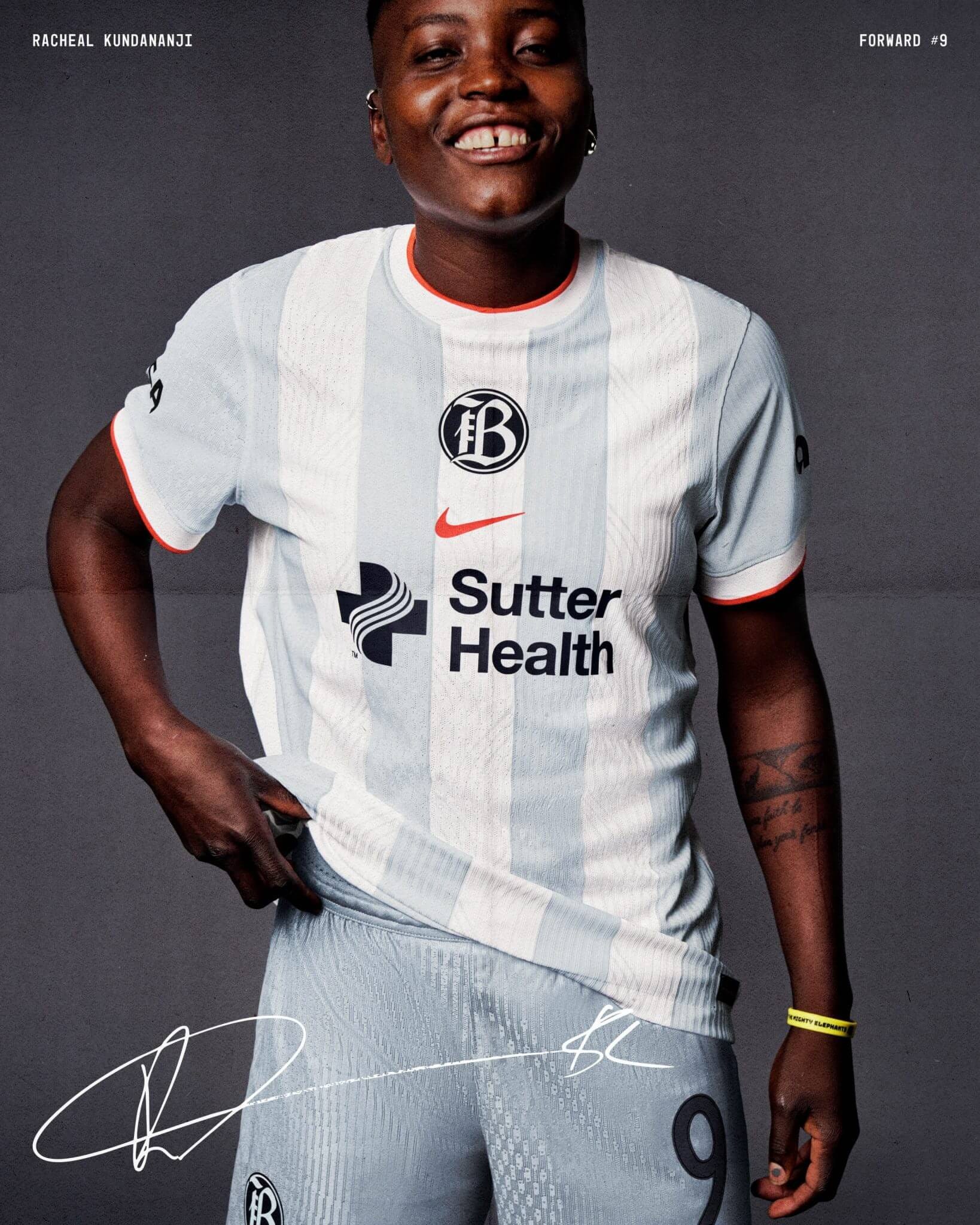
Thank god for this rebrand. The kits last year were a flop and a half. The only redeemable thing about Bay FC’s merch last year were the fly letterman jackets they didn’t even start selling until after the season ended. Now that the team has finalized its brand identity, Bay FC debuted not just one but two new jerseys this season. My personal favorite is the secondary with the pale blue and white—a kind of moody, overcast nod to the Argentinian classic. This one is definitely one of my favorite secondary kit drops of the season.
Fire factor: High
North Carolina Courage’s “Believe” kit
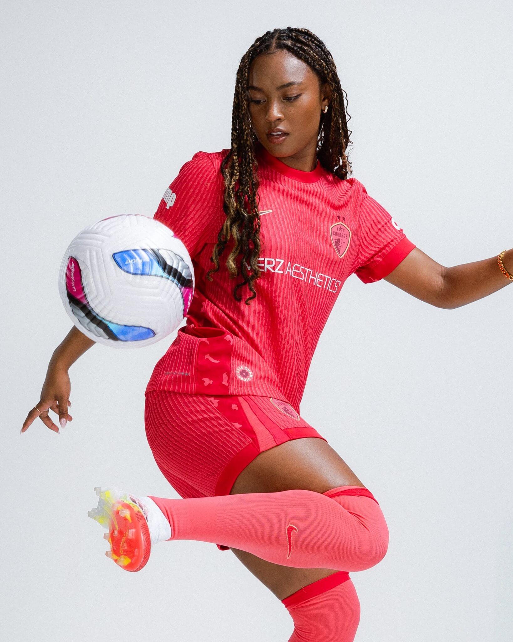
I love everything Jaedyn Shaw does, so I won’t act like her juggling this ball in North Carolina’s new secondary kit didn’t have an influence on me. But this monochromatic moment is working for me. Similar to Orlando, we are loving the new takes on the old ribbed jerseys. I don’t think the replica jerseys will quite hit the same, but I love the original. The red-on-pink sets the bar high. This kit is sleek, stylish, and a definite upgrade from last year’s primary.
Fire factor: High
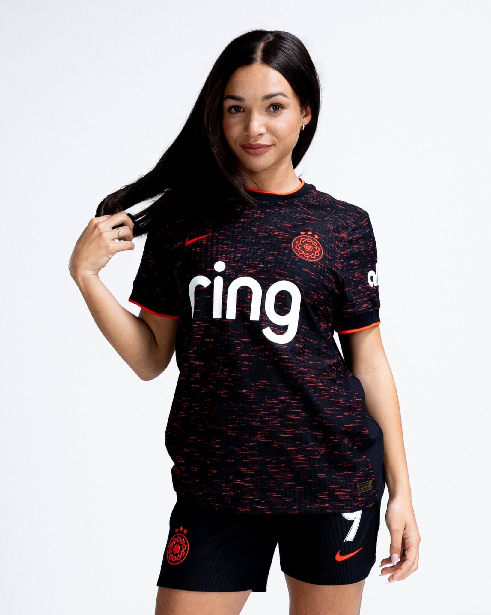
Racing Louisville’s “Roots” kit
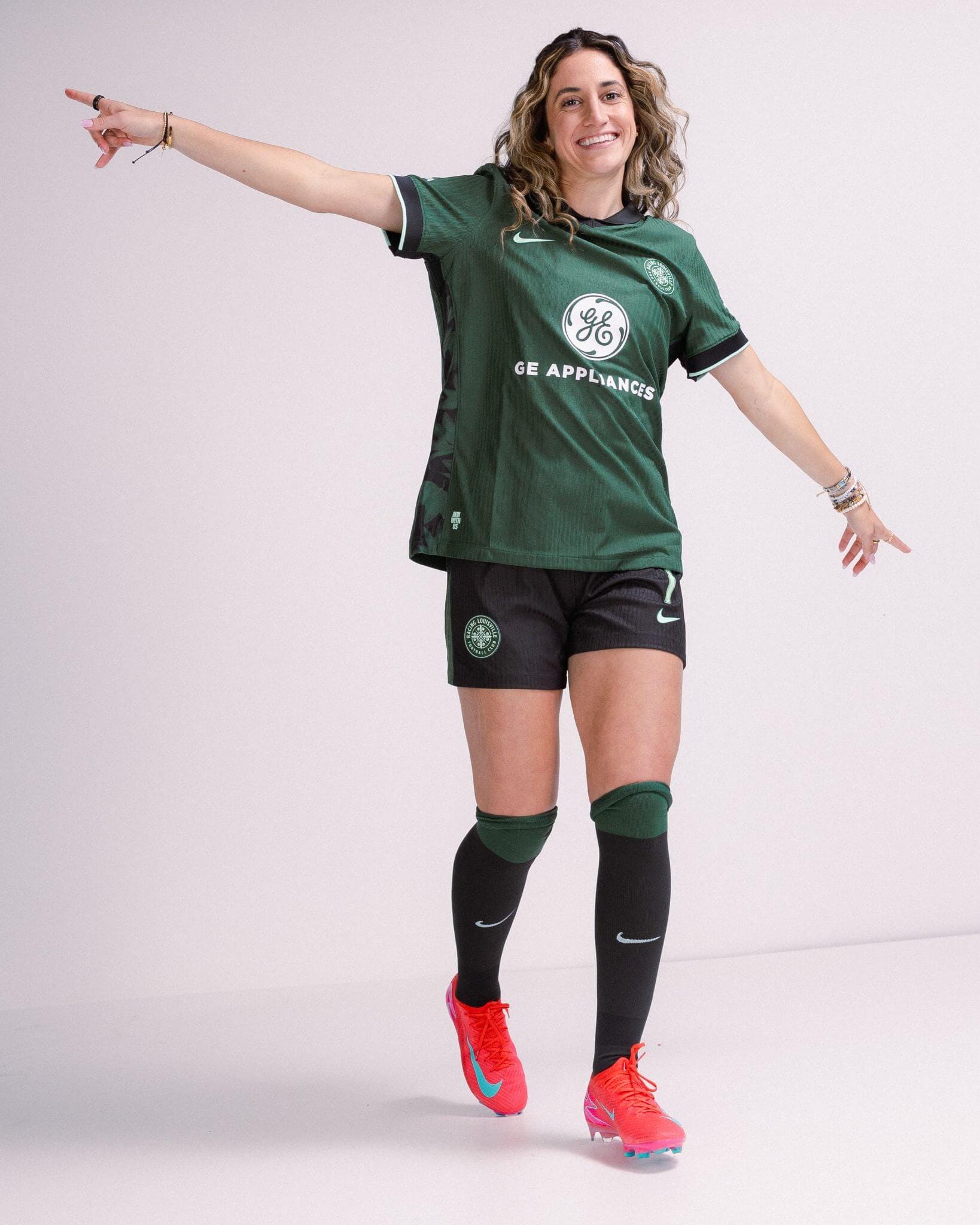
This is by far the sexiest secondary kit drop of the 2025 NWSL season. I must admit that I am slightly confused because since when was forest green one of Racing Louisville’s colors? Maybe they just wanted to beat out Denver and Boston as the first team in the league with a dark green and black kit. Either way, the only thing that makes me mad about this jersey is that Louisville beat us to it. But even my jealousy won’t stop me from ranking this one #1.
What are your thoughts? Which secondary kits would you buy, and which are just too cringe to get behind?
I always prefer dark kits so I'm a little biased but the Spirit and Houston colors are just so much...
Obsessed with just how piping hot these takes are. Your units of measurement were lovely to boot.